
UX Designer & User Researcher
Paw-ket Book is a mobile app connecting pet owners with real pet experts for advice and appointments. It's a personal project showcasing my UX design skills from my CareerFoundry UX Immersion Course.
Paw-ket Book
Don’t feel like scrolling? View the prototype here
IMPORTANT: View the prototype in full-screen. Certain monitor sizes cause it to malfunction in normal view.
My goal is to develop an app that allows users to swiftly and easily have all of their pet related questions answered - saving time and money.
Overview
Project Scale
5 months
Figma, Miro, LucidChart, SurveyMonkey, OptimalSort
Tools Used
Role
UX Designer & Researcher
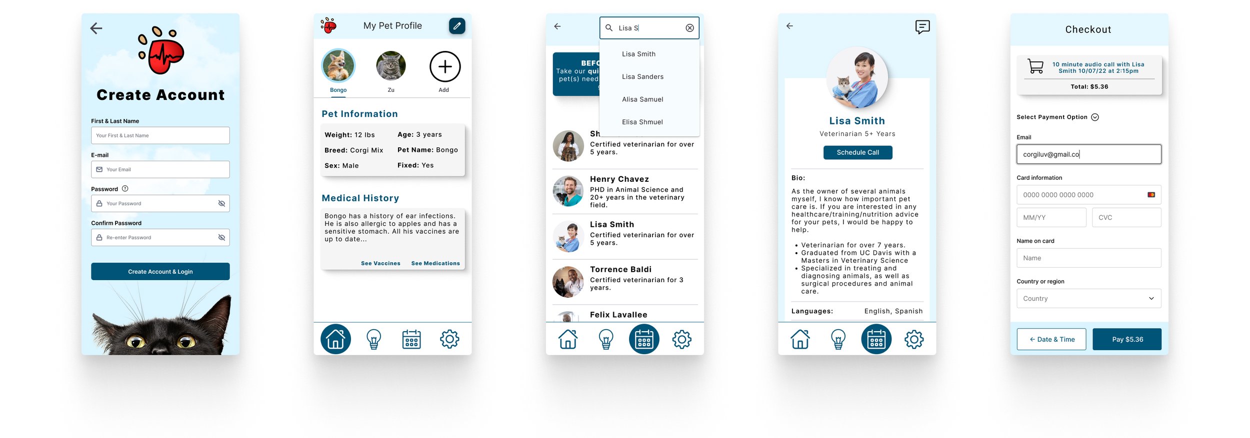
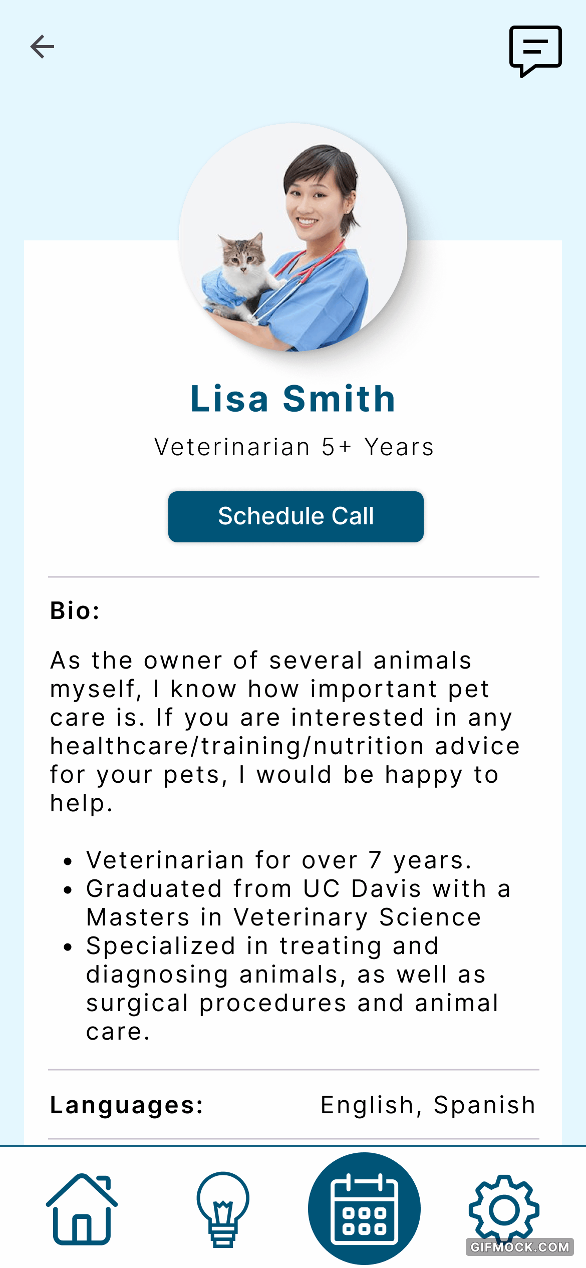
Paw-ket Book lets you schedule and attend a veterinarian appointment right from your couch, for a fraction of the price.
What are other companies doing?
I conducted a competitive analysis of a few competing companies in order to see if there is an existing market for an animal expert app.
Sneak peak ->

Overview
Dr.Tail (https://www.drtail.us/) is a free vet consultation service. They guarantee service within 72 hours.

What do we need to do?
I created a business requirements document to condense all business goals, customer needs, and stakeholder concerns into one place.

Defining the Problem
Determine what features would be useful or unused in our pet expert application.
Identify the most important characteristics users are looking for in expert responses.
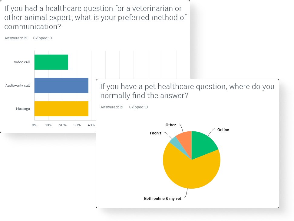
Learn how often users have pet health questions and how they currently go about getting answers.
-
20 participants were surveyed using SurveyMonkey.
3 participants were interviewed both in-person and online. The sessions lasted around 30 minutes each.
All participants are cat or dog owners.
-
65% of participants feel they've been overcharged for issues that could have been handled at home.
Many features that I thought would be useful ended up being useless to users.
85% of participants have only a few pet healthcare questions a year, so a membership isn’t necessary.
100% of participants know where the closest vet and pet ER is, so a map feature wouldn’t be useful.
-
Participants desire fast, reliable answers from a trusted source. While features like blogs and articles may perform well, digital record-keeping lacks interest. A preferred approach is providing pet owners with non-interactive resources like FAQs, how-to videos, pet health handbooks, and information on common pet issues. Other proposed features like a map and community tab are unneeded, much to my surprise.
Who are we designing for?
I created three different user personas to view my app from, each based on research from my target audience.
If my app is able to fulfill the needs and goals of my personas, I know I’m on the right track.
What do they need?

Analyzing & Synthesizing Data
Only 20% of users expected to use the 'Experts' tab for scheduling appointments, despite being what it was created for.
I used the data I gathered from my card sort to update my sitemap and user flows.

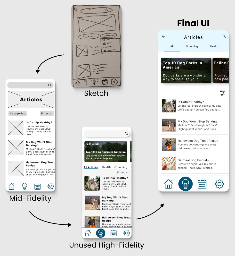
Turning Concepts into Designs
Usability Testing
Tested 6 participants using a mid-fidelity prototype for ease of adjustments.
83% of the participants had trouble navigating to the “Learn” tab.
66% of participants couldn’t recall information from the on-boarding.
Having a new on-boarding system and consolidating the “Booking” and “Expert” tab will ensure users get a smoother and more intuitive experience.
68% of 19 participants preferred having two distinct buttons for "Login" and "Sign Up" in my A/B test.
(Note: The final UI for this screen is different but retains the button placement.)

Style Guide & Pattern Library
Typography, interactions, colors, UI components, grid styles, imagery, accessibility requirements, and more.
Final Results
After doing some peer reviews of my UI and editing some features of my app to make them more accessible, my designs were finalized.


IMPORTANT: View the prototype in full-screen. Certain monitor sizes cause it to malfunction in normal view.
Future Iterations
If I were to continue working on this project I would be sure to fully fledge out the videos section, owner handbook, settings, and emergency quiz.
As of now, the prototype only has the key features that users would use. Next, I would perform some more usability testing to ensure that everything goes smoothly. I would also redo the UI to be up to par with my current design skill-set.
Retrospective
My biggest challenge was differentiating the app from common applications that already exist on the market. I wanted to be sure it provided users with a few useful features, but not overwhelm them with things they will never use.
It was fun, challenging, and fulfilling to see a project through from the very beginning with research and sketches - to the very end with a high-fidelity prototype.

Bonus: My dog, Azula!